New branding for Finzen
Scope of work: company name, company slogan, visual identity, brand guidelines, business stationery, key visual, advertising slogan, information architecture, promo materials, website

FM Invest are specialists in the banking sector. They rely on hard data. "The calculator does not lie" is the motto, which is meant to confirm the professionalism of services and the accuracy of decisions. For over 8 years, they have been supporting businesses and individual clients in the acquisition of capital and optimisation of the financing structure.
Our task consisted in creating a new brand identification, beginning with the development of the name and claim, through visual identification, ending with the preparation of the leaflet and website.
Name project
We used the word Finanzen to construct the name, in which we reduced the “an” element. We intentionally chose a German word. Firstly – it is a strong differentiator on the market, secondly – its origin is a strong synonym of the features sought after in financial consulting – certainty, quality, knowledge, experience, innovation, professionalism.
Finanzen German for finance – that is, the economic relations consisting of collecting, sharing and spending monetary resources, also commonly referred to as domestic budget management – i.e., household finances.
Zen – Zen is understood as a “calm mind”, “controlling the thinking process”, “assimilating concepts”. It is the concentration of your thoughts to a single point and contemplating the truth of life through the practice of sitting meditation. By practising Zen, the mind regains freshness and thinking becomes as transparent as water. In other words, Zen is a liberated conscience, tool and the final shelter.
Company slogan
We developed claim “Tailor-made Banking” that describes the brand’s philosophy and indicates its competitive advantage, and in turn, complements the name by directly communicating the business activities of Finzen.
Tailor-made Banking
Logo
Due to the grapheme structure of all the letters, the capital letters consist only of lines (vertical, horizontal and diagonal), as the basis of the logo we chose a one-piece font style. The letter “I” with a diagonal finial is a distinctive feature that alludes to the gold bar – a synonym of prosperity and profits. We used the gold texture and the convex frame of the letter “I” as an element of brand communication.
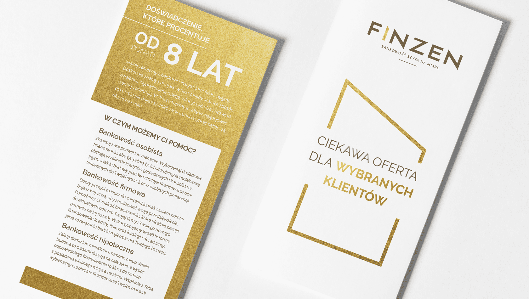
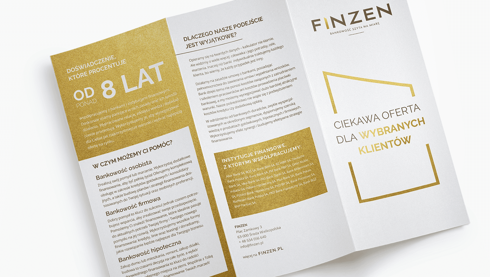
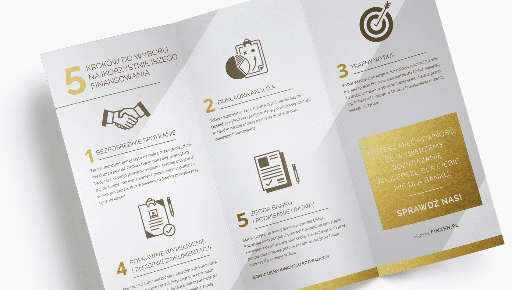
Leaflet
We designed a leaflet in DL format as the primary medium used in direct meetings of the advisors. The media presents the method of operation and arguments in favour of Finzen’s services.
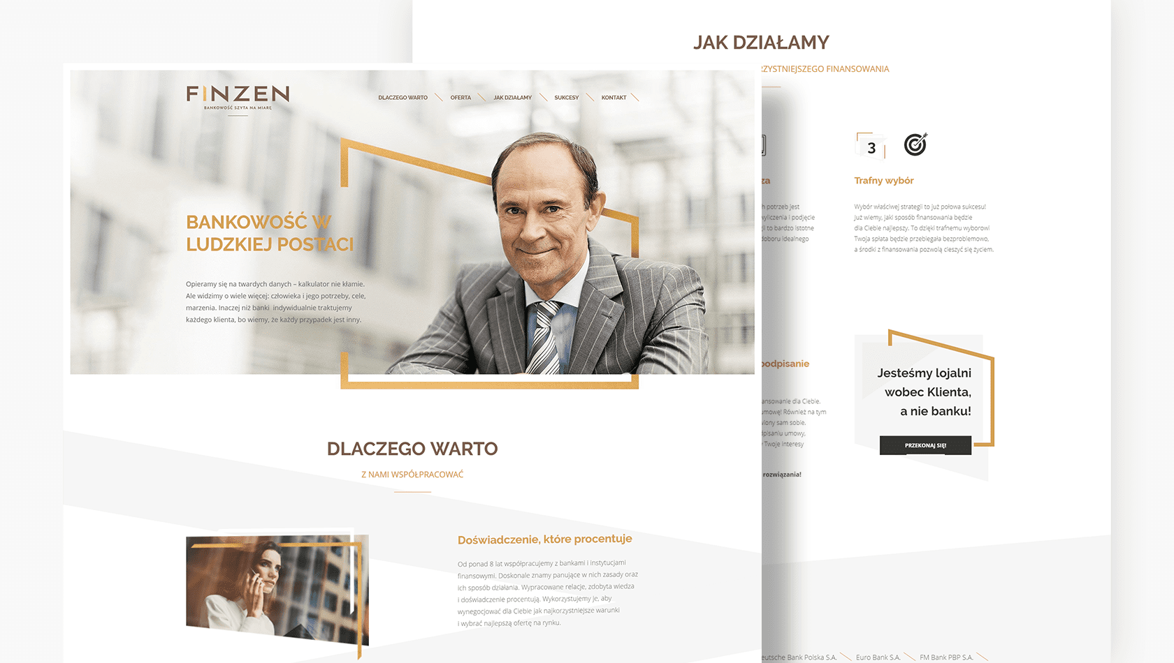
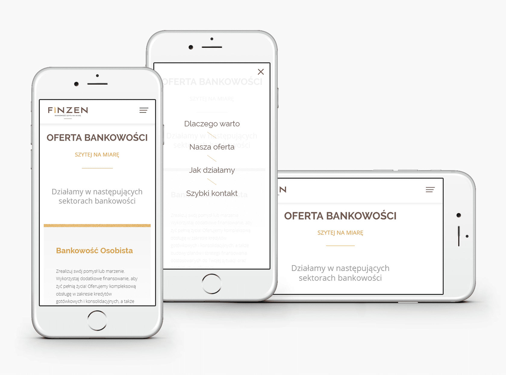
Website
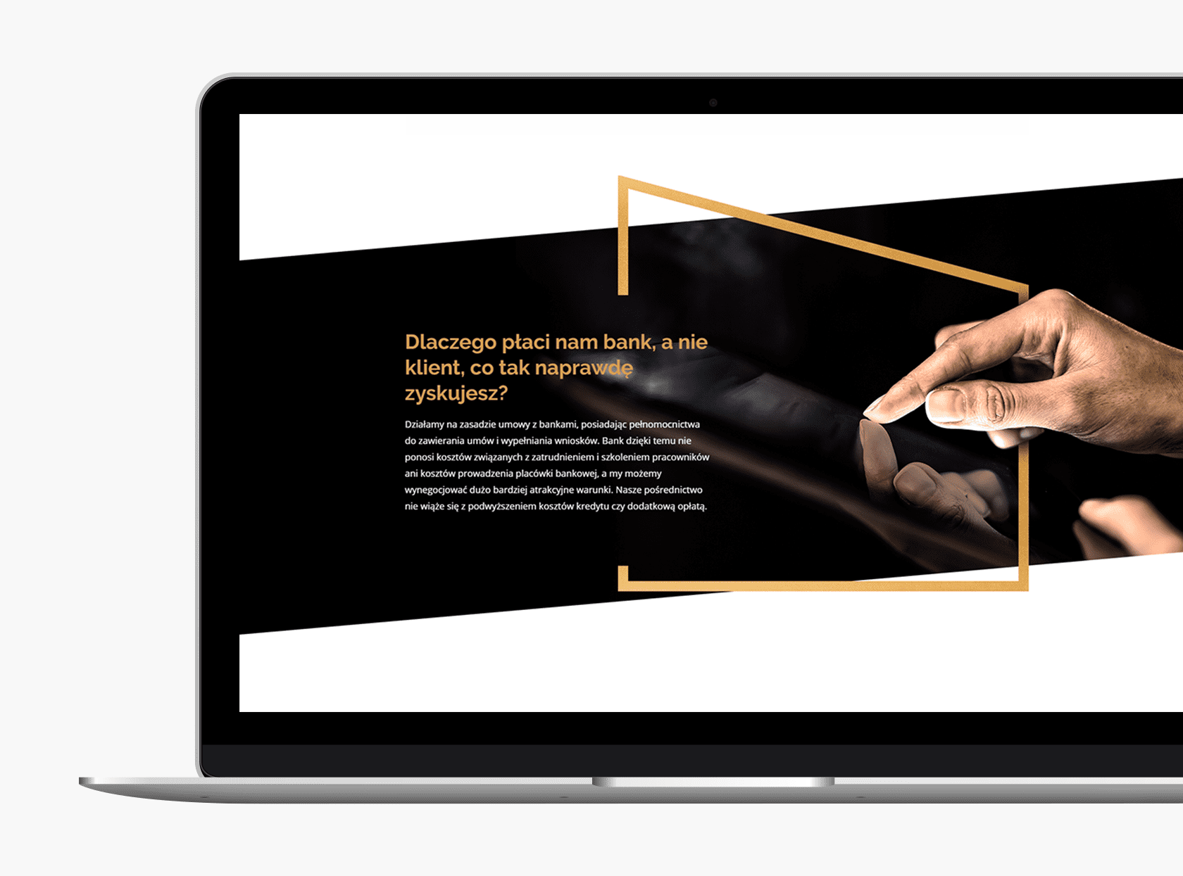
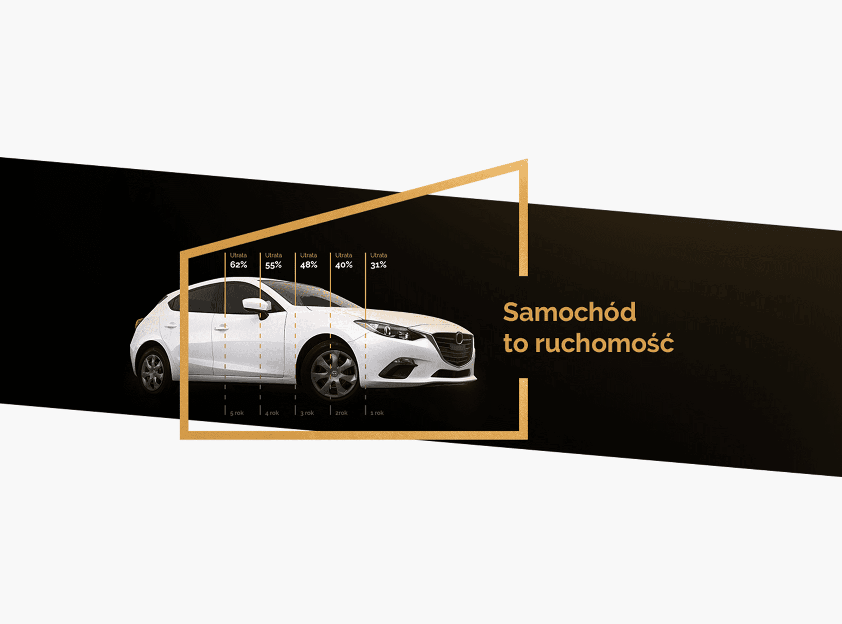
We drew attention to the very high rotations in the financial advisory industry, where account managers change several times in a year, and the young age of consultants means the public increasingly less trusts the sector. Therefore, we chose the picture of an experienced advisor for the main page of the website, who sees on the opposite side a client and his/her needs, and not a commission table.
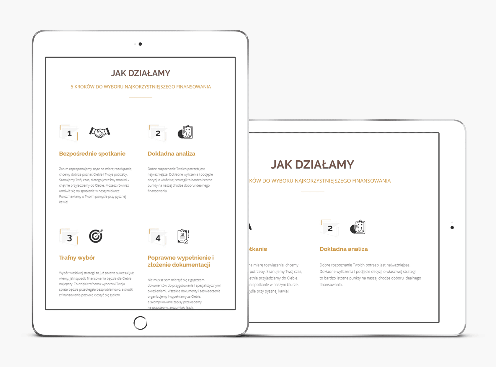
Information architecture
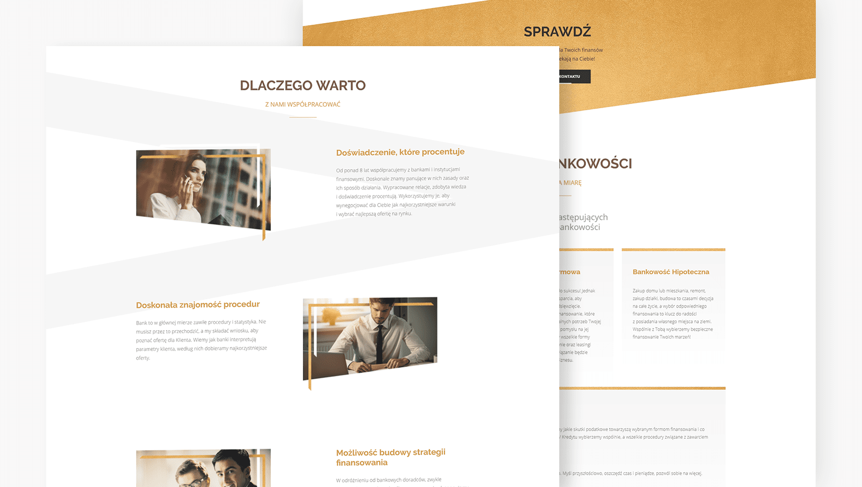
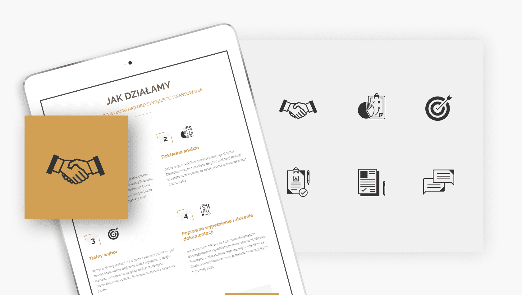
In creating the information architecture of the website, we clearly communicated the information that was most often discussed at meetings – the advantages of cooperation, the method of operation and remuneration.
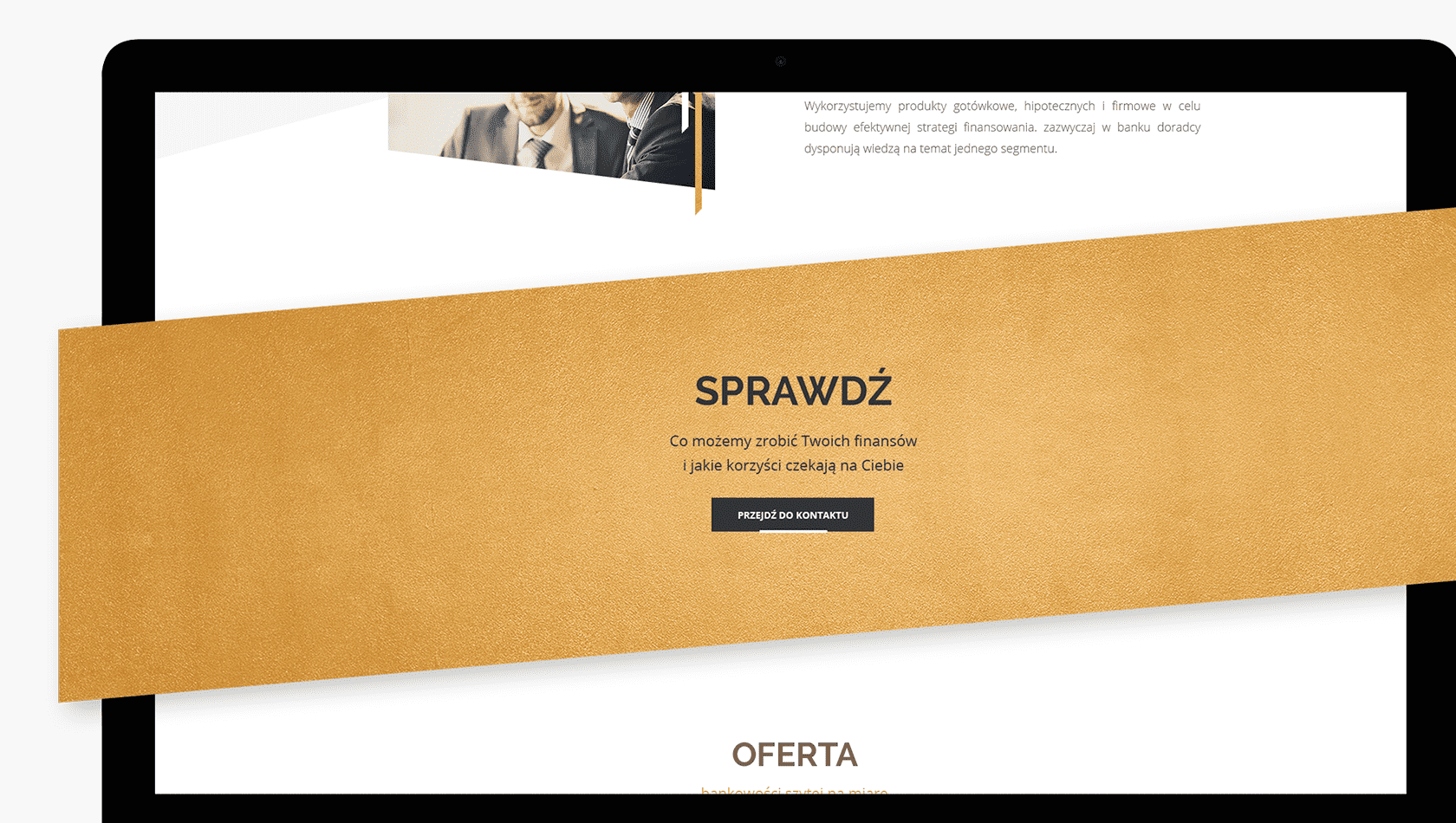
We used the bevels not only to separate individual sections but also to expose the CTA, distinguishing them with gold texture.
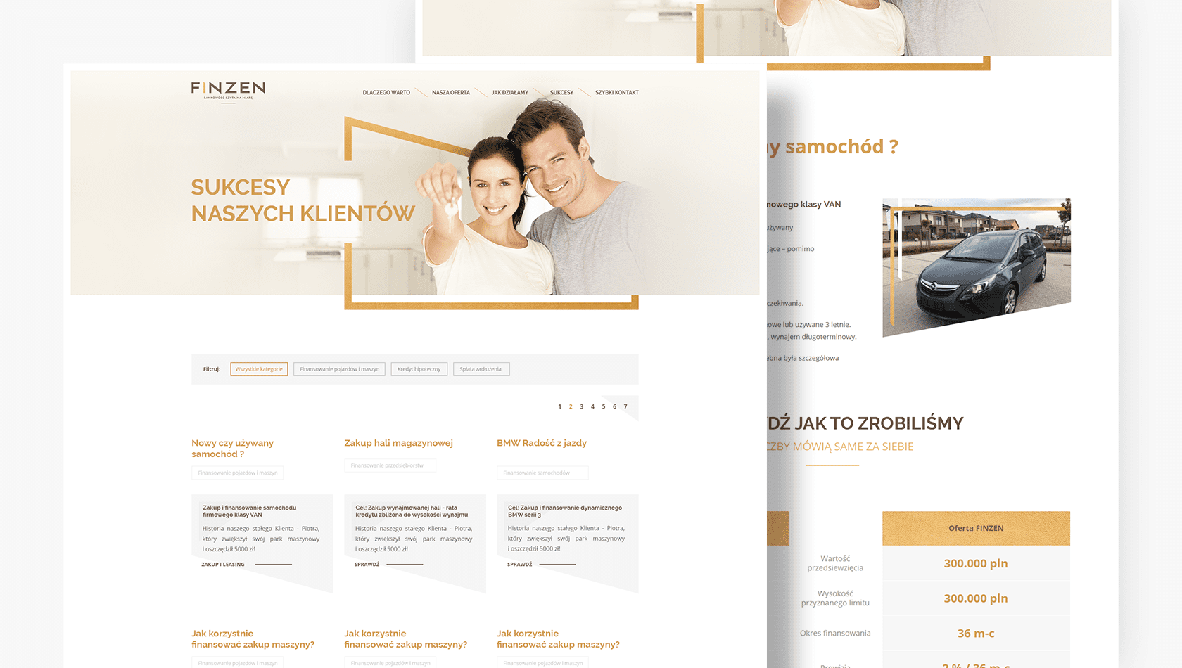
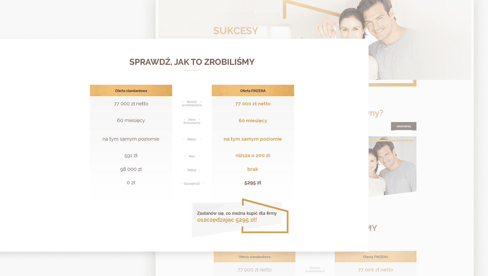
Our clients’ successes
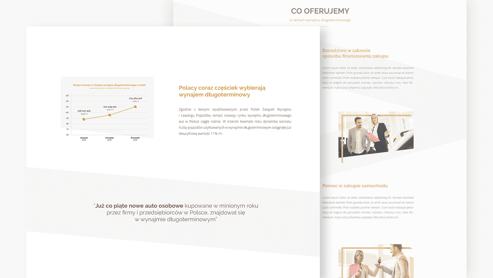
During the development of the website, we prepared new sections. Our clients’ successes – is a section presenting case studies, as befits Finzen, the benefits were shown in the form of hard data – in tables.
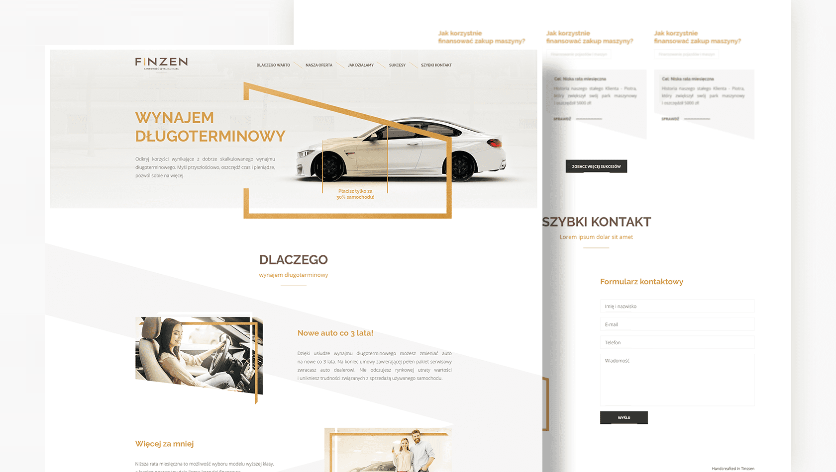
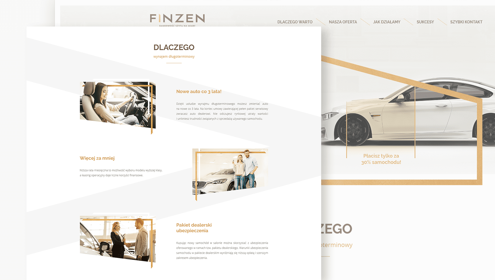
Long-term rental
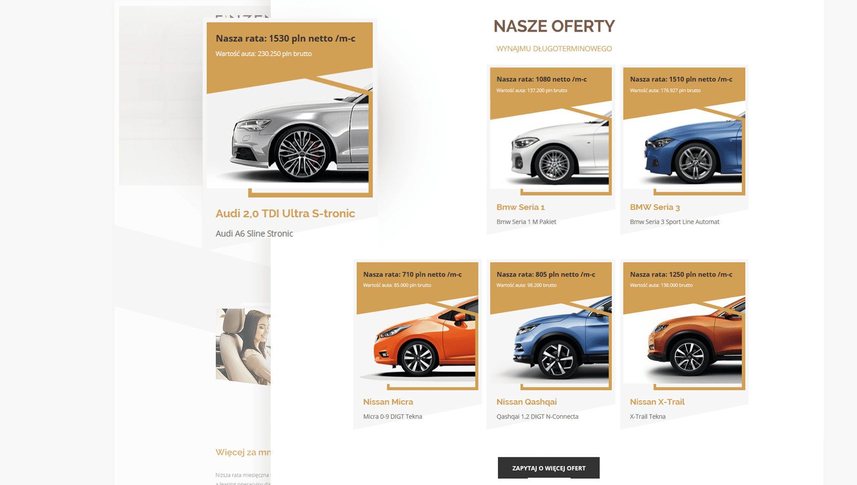
On the other hand, long-term rental is a sub-page that explains to the recipient, what this service consists of, shows examples of implementations and indicates the differences between it and leasing. Also, the sub-page acts as a landing page for an advertising campaign in search engines.
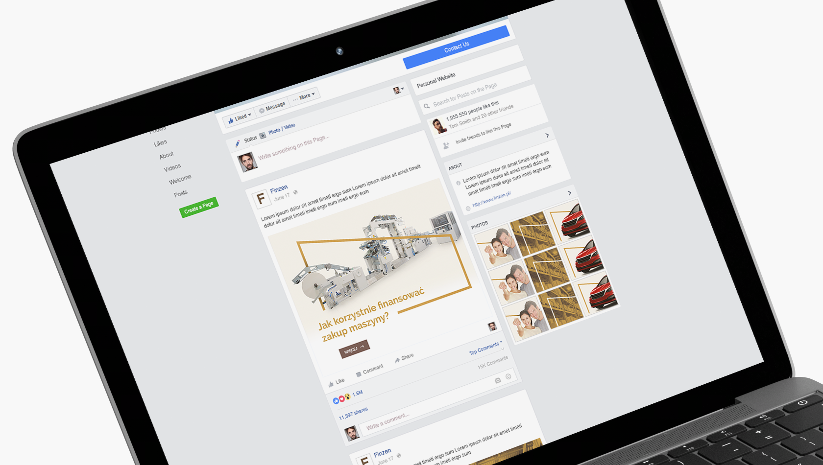
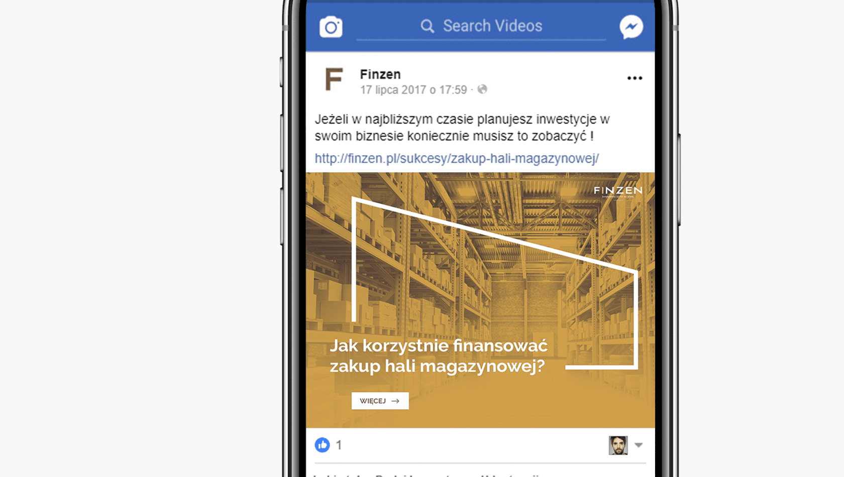
Social media
For graphics published in social media, we prepared an individual layout, which thanks to the distinctive motifs allows you to distinguish between the posts and facilitate the identification of content published by Finzen.