Visual Identity for Shieltec
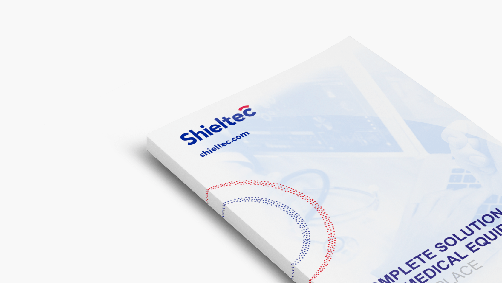
Shieltec is a team of experts involved in equipping medical diagnostic imaging centres. The company, located in Great Britain deals with the comprehensive construction and servicing of Faraday cages and anti-radiation shields. It is also a producer of non-magnetic equipment designed for work in MRI rooms.
The name for the new company was invented by its owners. We, in turn, handled the visual identity.Logo genesis
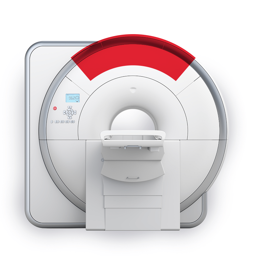
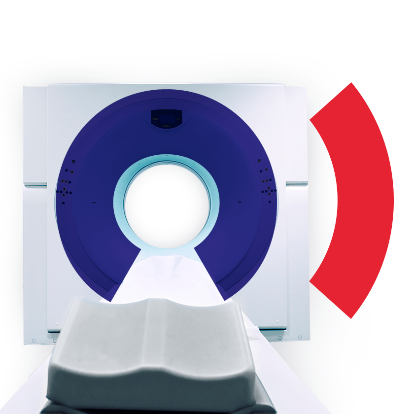
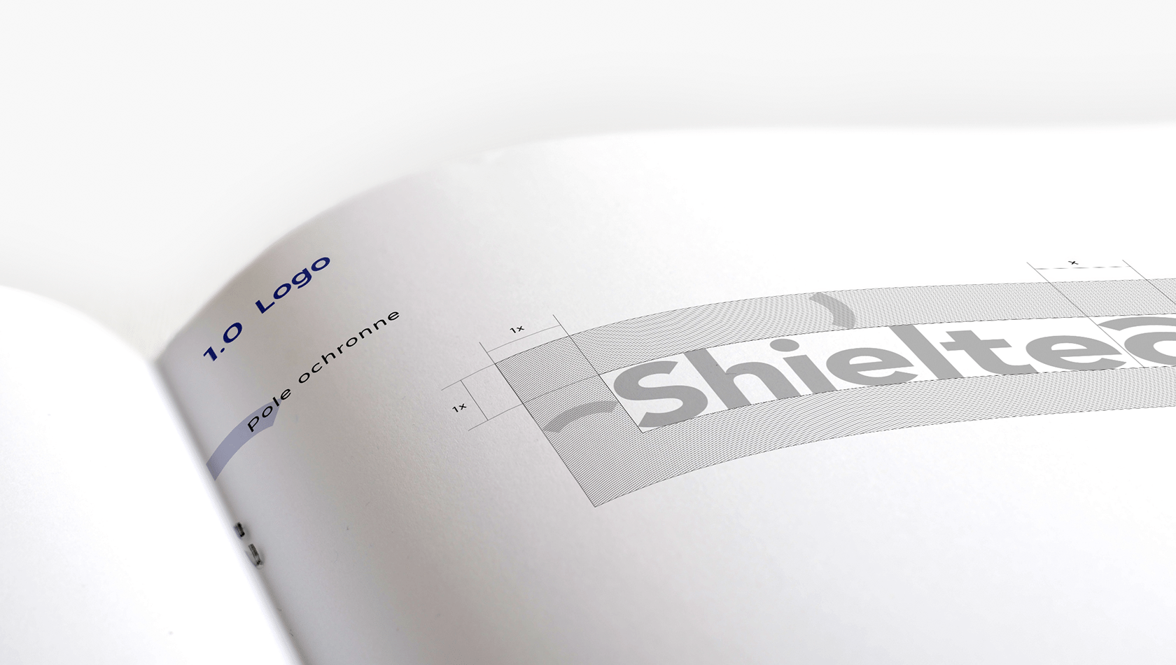
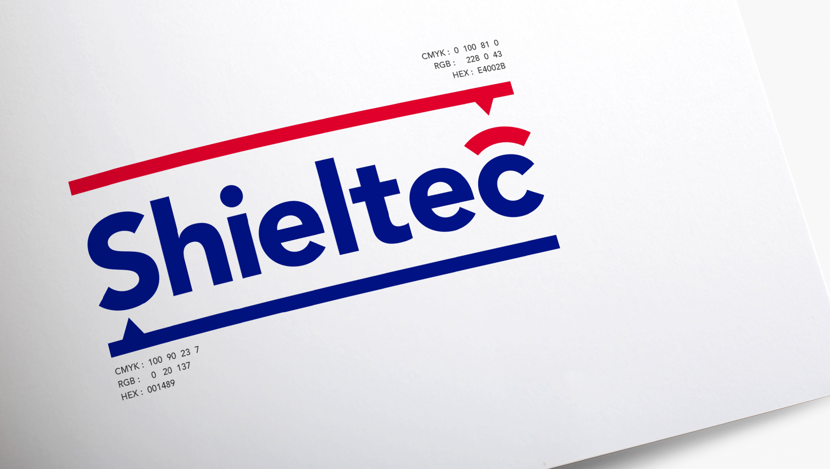
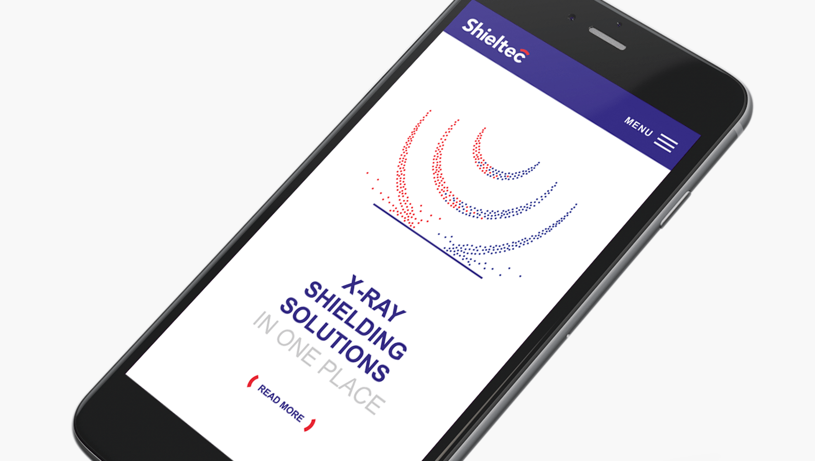
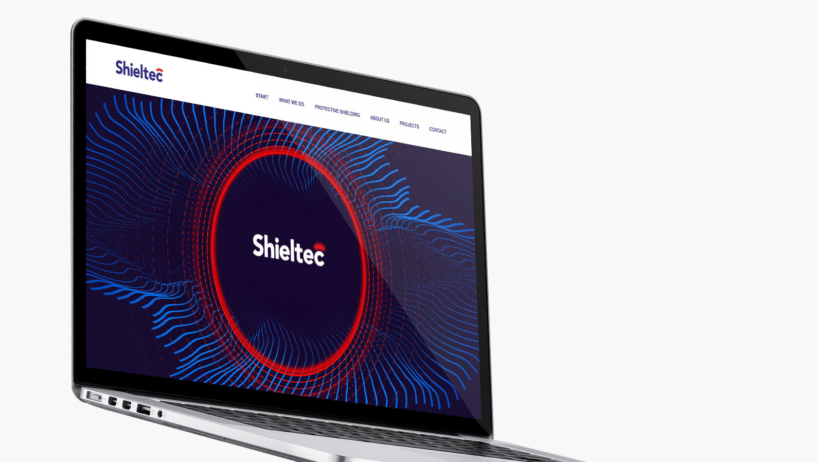
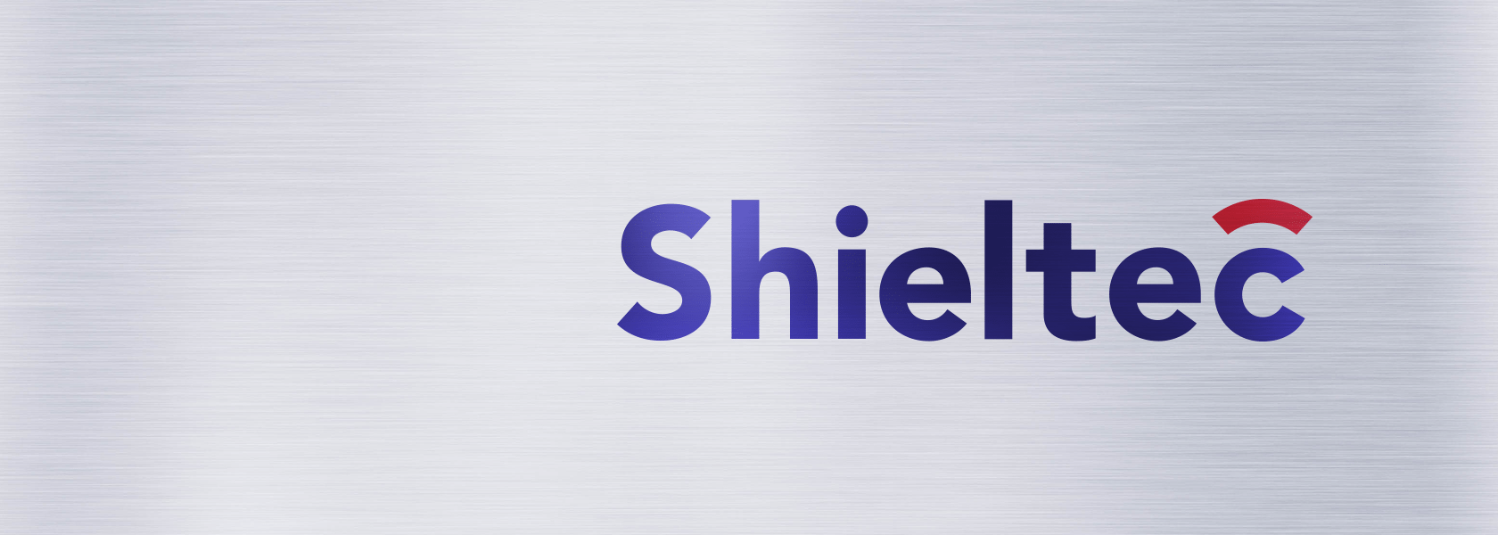
Given the very narrow specialisation of the company, the creation of the logo was based on the subject of magnetic resonance. We used the symbol of magnetic poles to determine the colour of the logo while the characteristic shape of the MR apparatus was expressed in the signet inscribed in the last letter of the name. The red arc above the letter C is also a shield symbol included in the first part of the company’s name.

