Visual identity for Finzen

FM Invest are specialists in the banking sector. They rely on hard data. "The calculator does not lie" is the motto, which is meant to confirm the professionalism of services and the accuracy of decisions. For over 8 years, they have been supporting businesses and individual clients in the acquisition of capital and optimisation of the financing structure.
The visual identity of the new brand was to blend in with the company's philosophy - simple principles, transparent rules, hard data and real benefits. Consequently, we chose a simple, but eligible and elegant form.Logo
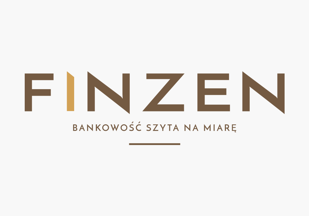
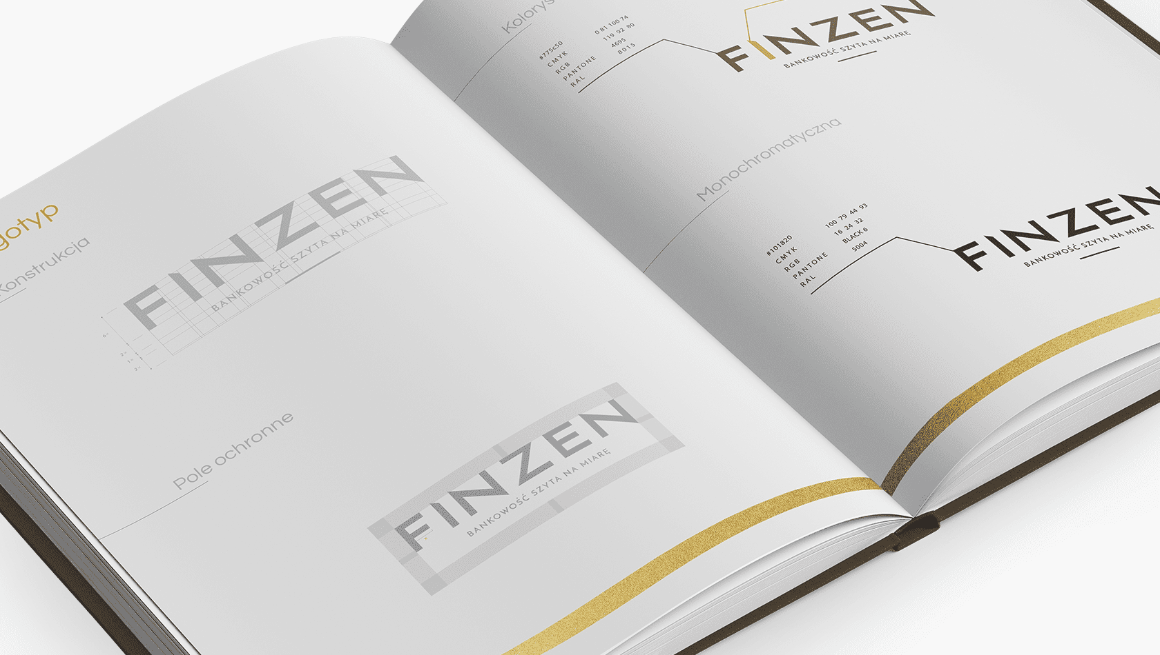
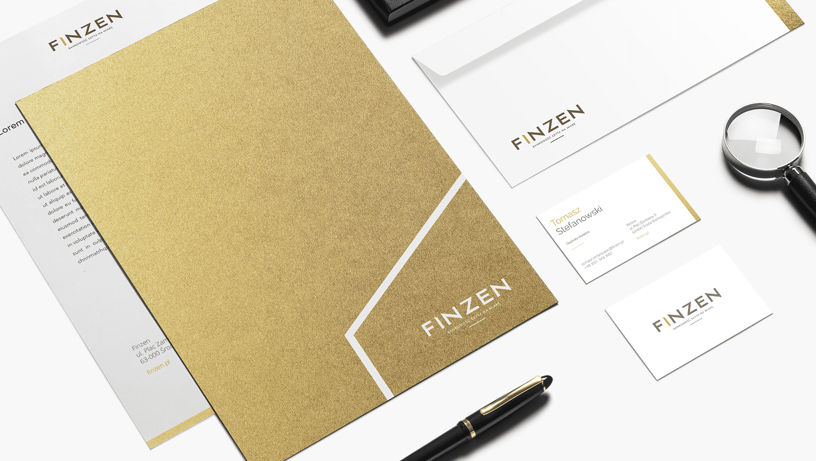
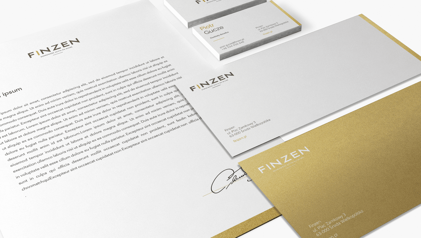
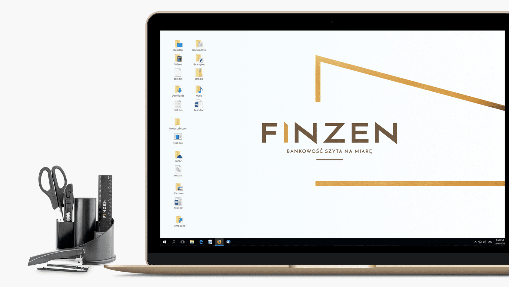
Due to the grapheme structure of all the letters, the capital letters consist only of lines (vertical, horizontal and diagonal), as the basis of the logo we chose a one-piece font style. The letter “I” with a diagonal finial is a distinctive feature that alludes to the gold bar – a synonym of prosperity and profits. We used the gold texture and the convex frame of the letter “I” as an element of brand communication.


