Branding for premium class windows
Scope of work: branding, name designing, brand slogan, advertising slogan, naming architecture, product names and slogans, brand visual identity, products visual identity, brand guidelines, business stationery, key visual

Sożal Window Factory in Solec is a company with 25 years history in the manufacture of window frames. The specialized factory, advanced technological park, tested materials and the highest quality components is the recipe for a premium class window. Although the products were technologically and qualitatively superior to competition, recipient did not identify them as such.
Sożal window factory entrusted us with the task of developing a new brand identity that will show the true qualities of the windows and make them be recognizable as a premium.
Naming project for a premium brand
While designing the new name, we focused on capturing the unique approach to window production – minuteness for detail, striving after perfection and reverence. By combining this approach with quality, we obtained the name Quelta.
from Eng. Quality – for some is the equivalent of beauty and delicacy, for others it is a certain degree of perfection, compliance with a model, pattern or requirements. Quality is also the customer’s satisfaction, satisfying customer specific needs.
from Eng. Cultivate – develop something with passion, hold something in reverence, show concern, nurture, support.
Designing a slogan
for Quelta
Our task was to develop a provocative corporate slogan that would encourage reflection and go beyond conventions. An additional difficulty was limiting the length to two, maximum of three words.
It’s time
for changesto choose qualityto make the right choiceto think of the familyto save on changing the windows to new ones
Naming architecture
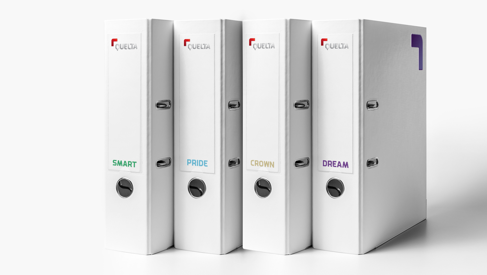
We developed a key for creating product names, then prepared names and slogans for five products.
SMART
Wisdom of choice
PRIDE
Look is important
CROWN
Queen of quality
DREAM
Fulfilled dream
HELPS
You can do more
Visual identity
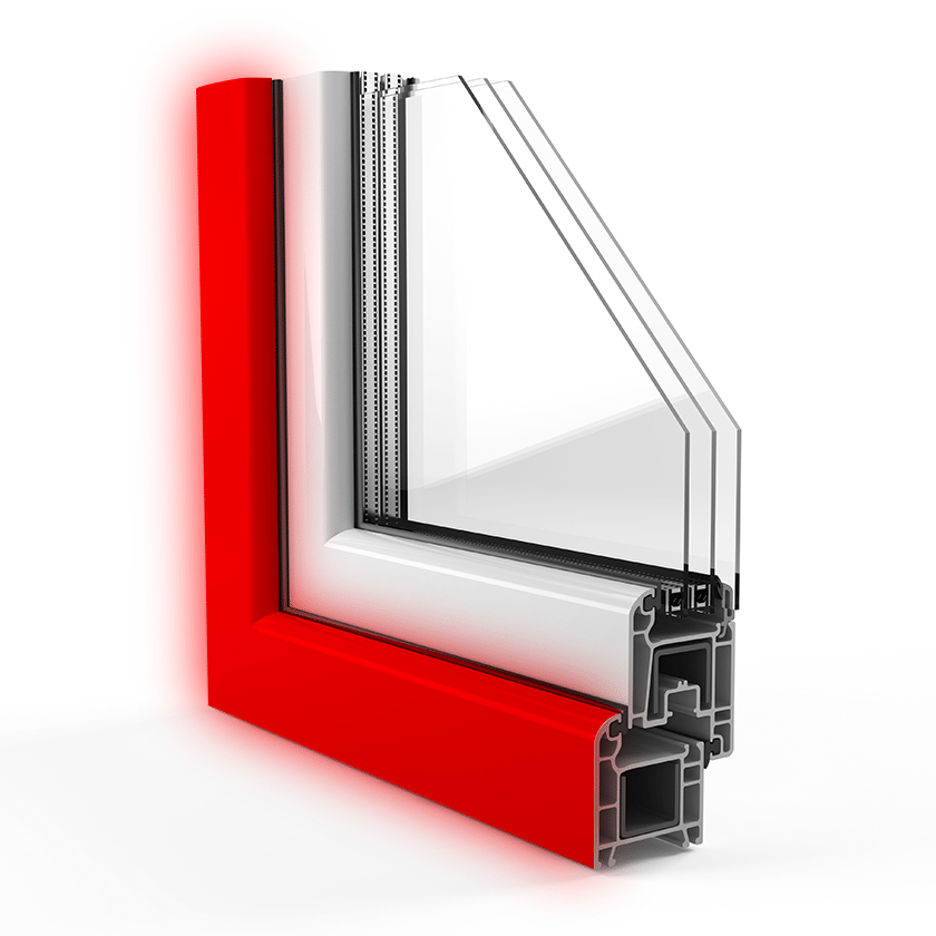
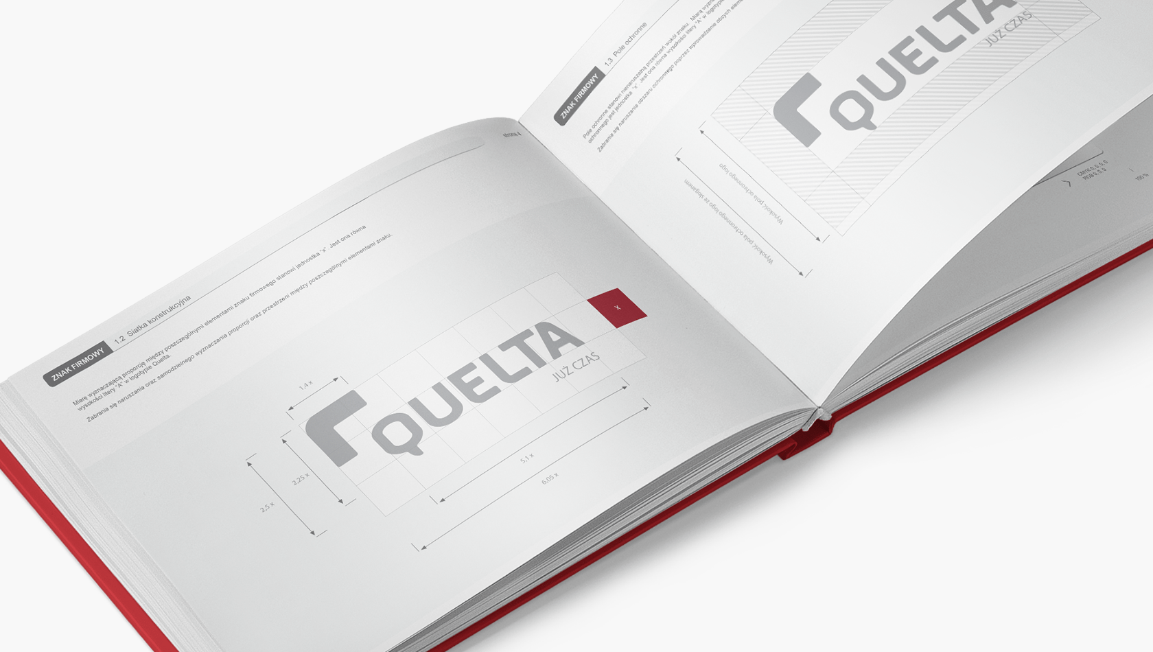
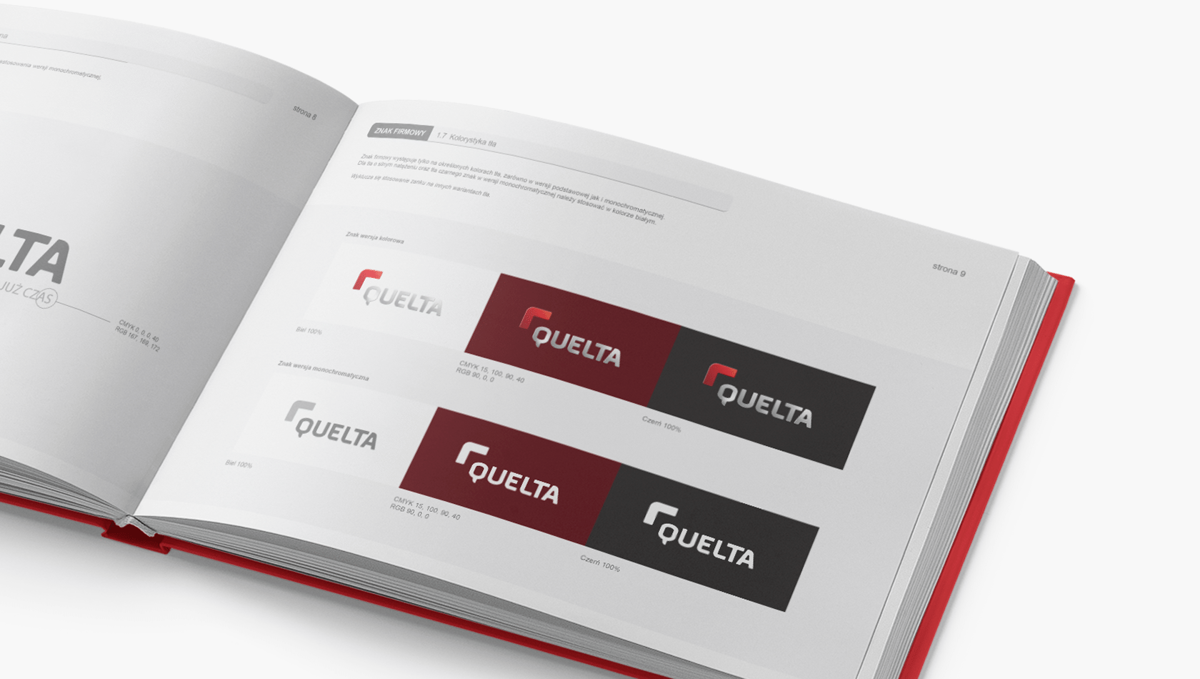
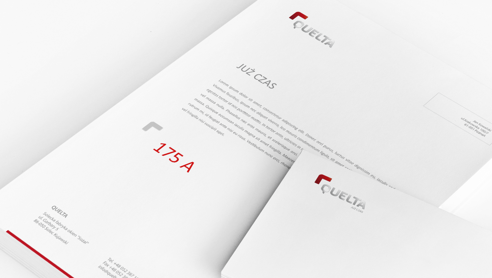
While designing the visual form of the name, we focused on highlighting the advantages of the product. We used shades of grey that allude to precious metal to emphasize quality, and with the help of window edges we highlighted the advantages – the interiors of the window.



Identyfikacja wizualna produktów
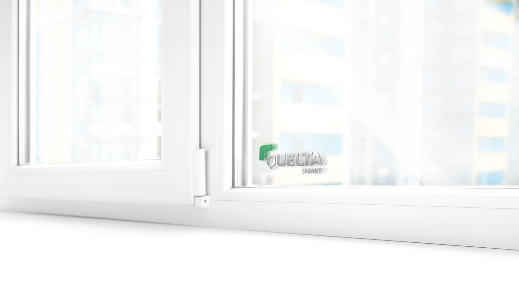
Na podstawie opracowanej architektury nazewniczej zaprojektowaliśmy identyfikację wizualną dla produktów marki Quelta.
Key Visual
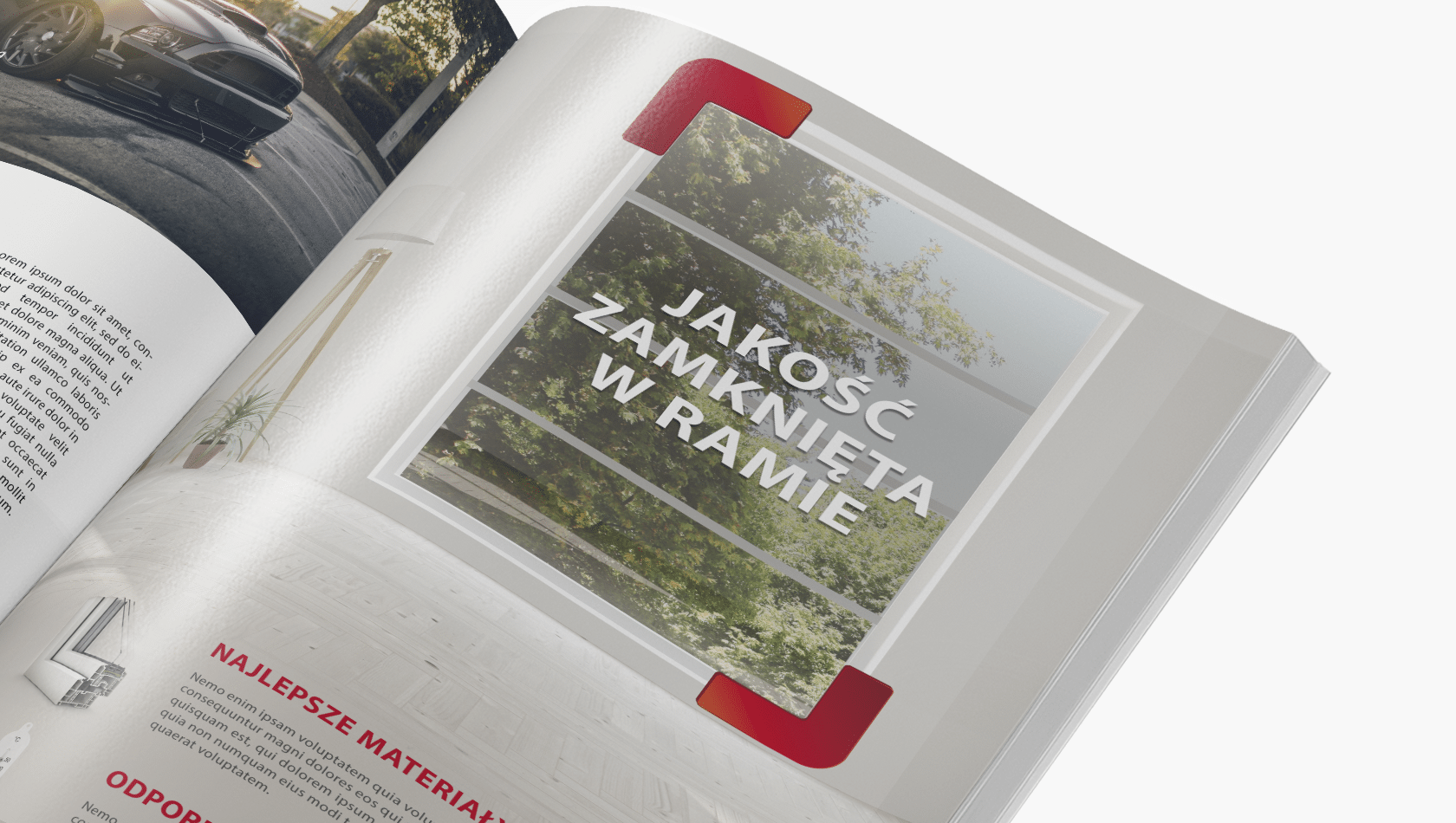
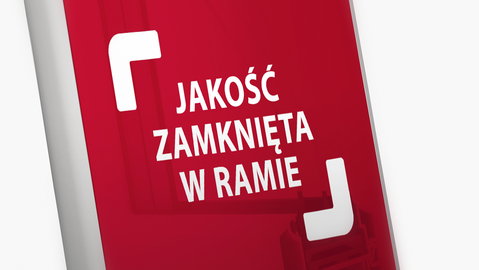
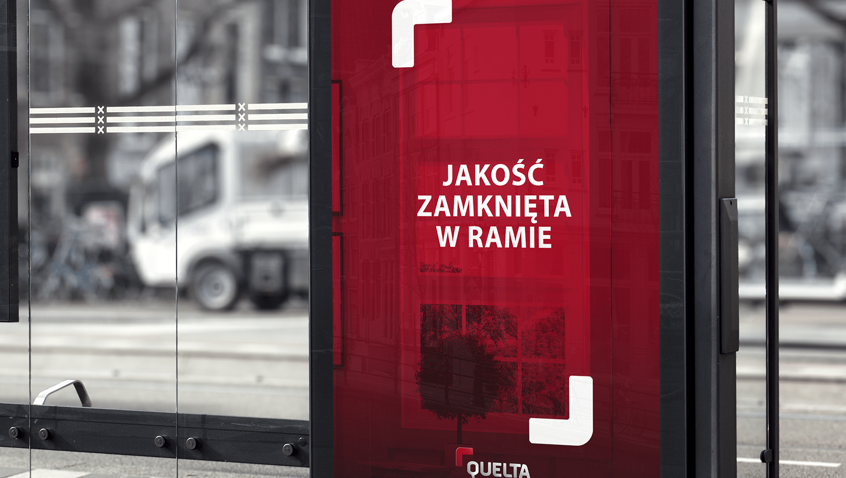
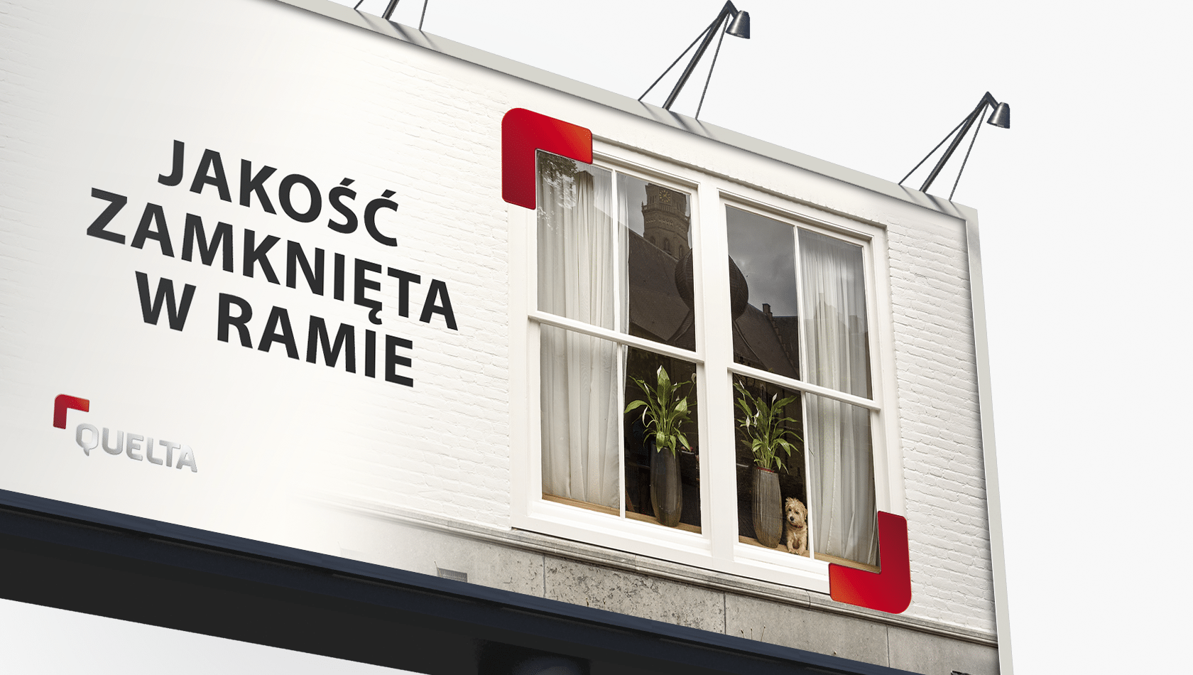
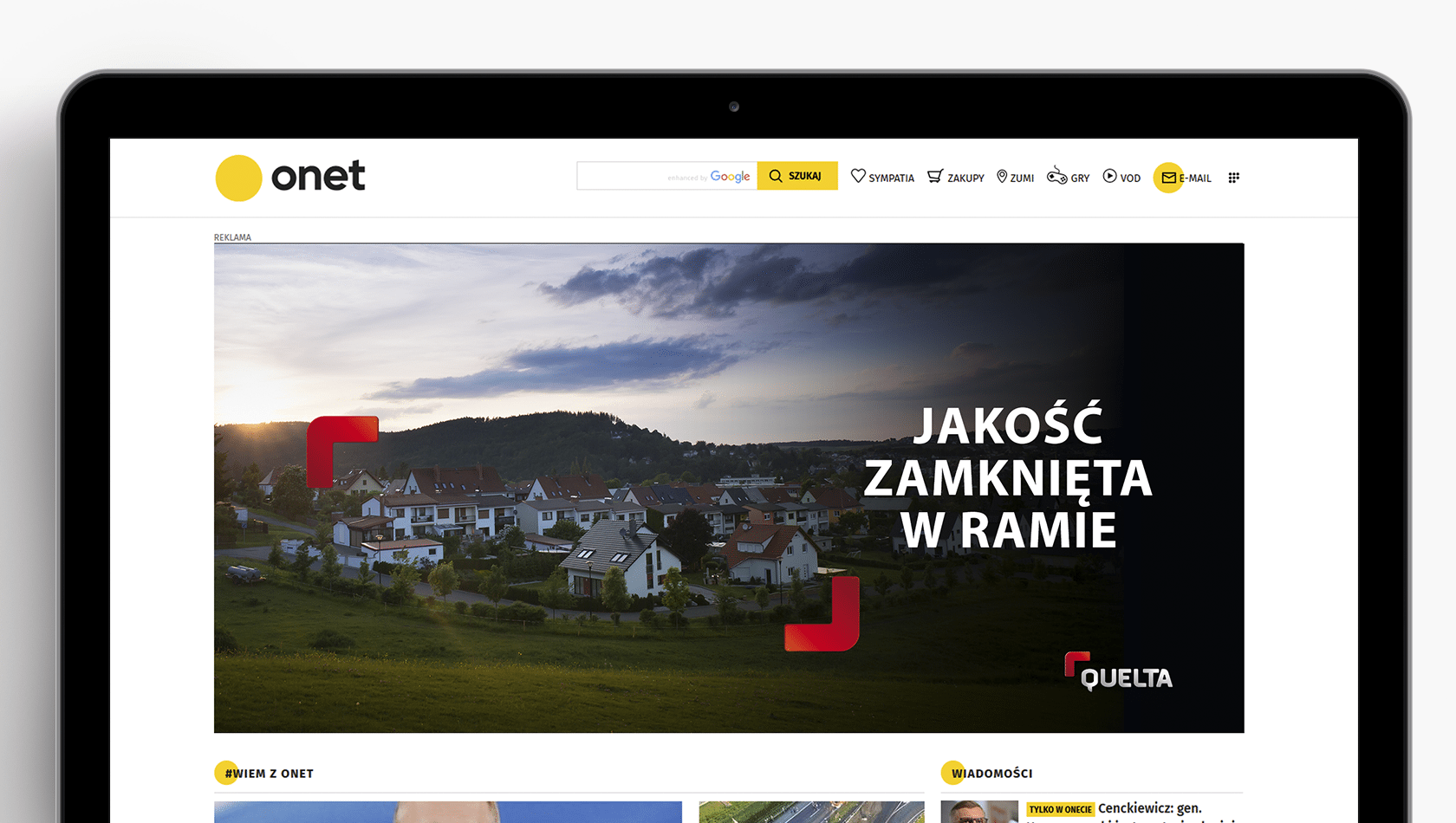
Głównym motyw graficzny dla materiałów reklamowych oparliśmy o sygnet marki, którym wyznaczamy narożniki ramy okna i eksponujemy hasło reklamowe “Jakość zamknięta w ramie”.
