New branding for Shieltec
Scope of work: visual identity, brand guidelines, business stationery, advertising slogan, key visual, information architecture, promo materials, website
Shieltec is a team of experts involved in equipping medical diagnostic imaging centres. The company, located in Great Britain deals with the comprehensive construction and servicing of Faraday cages and anti-radiation shields. It is also a producer of non-magnetic equipment designed for work in MRI rooms.
Verbal identity was also handled by the owners of the company. We worked on the visual part, beginning with identification, through the website, and ending with Key Visual and promotional materials.
Logo genesis
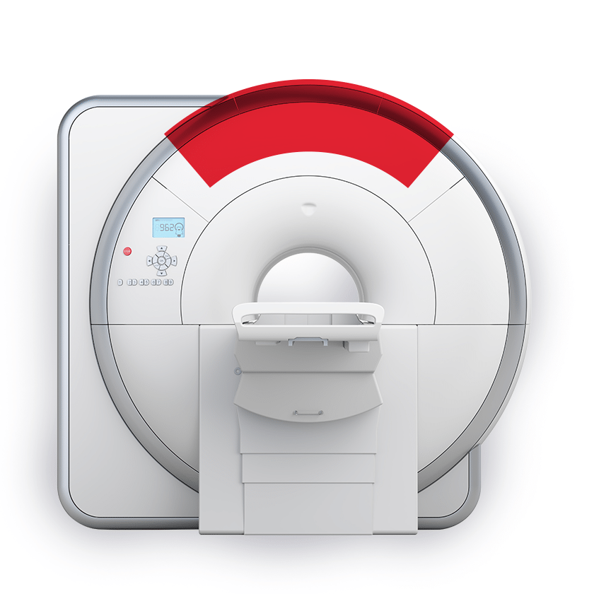
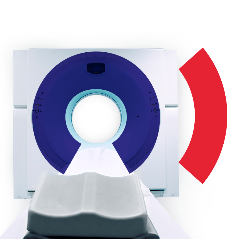
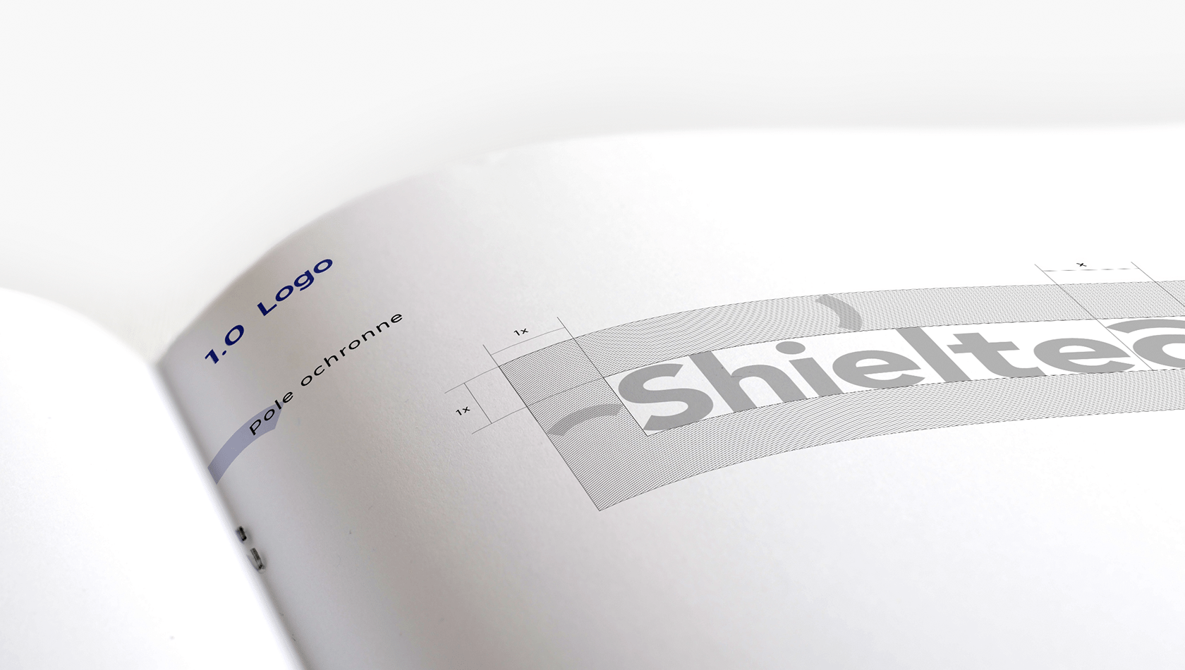
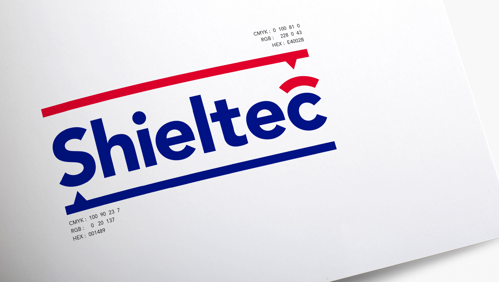
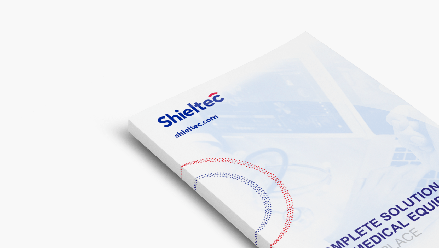
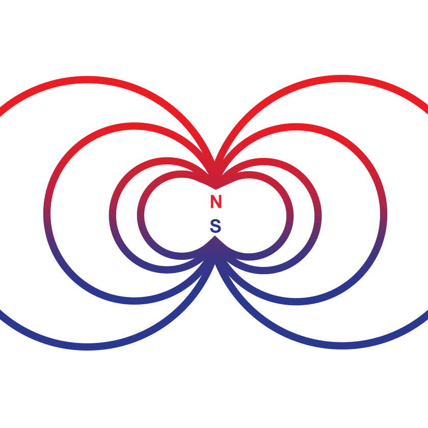
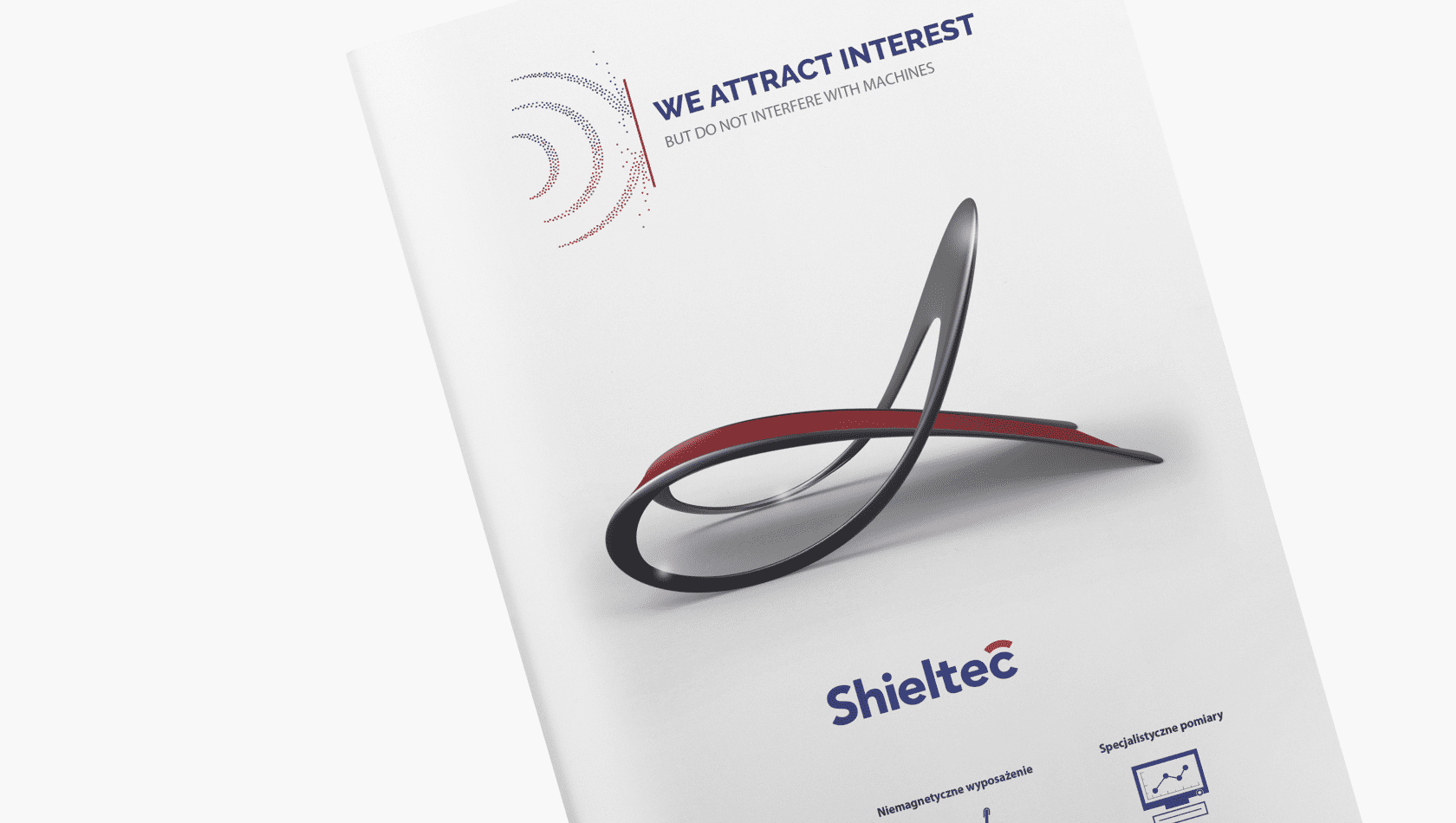
Given the very narrow specialisation of the company, the creation of the logo was based on the subject of magnetic resonance. We used the symbol of magnetic poles to determine the colour of the logo while the characteristic shape of the MR apparatus was expressed in the signet inscribed in the last letter of the name. The red arc above the letter C is also a shield symbol included in the first part of the company’s name.

Key Visual
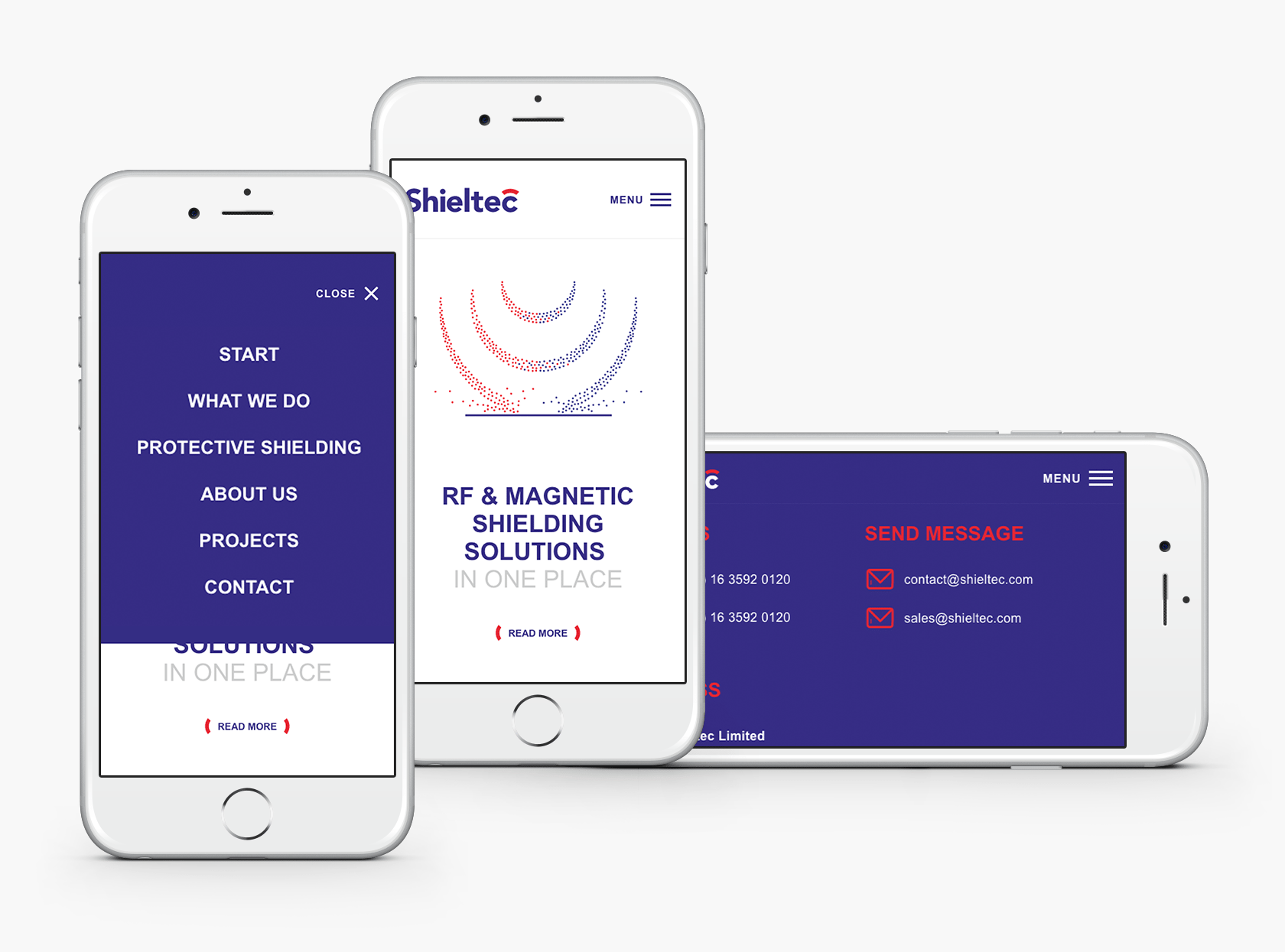
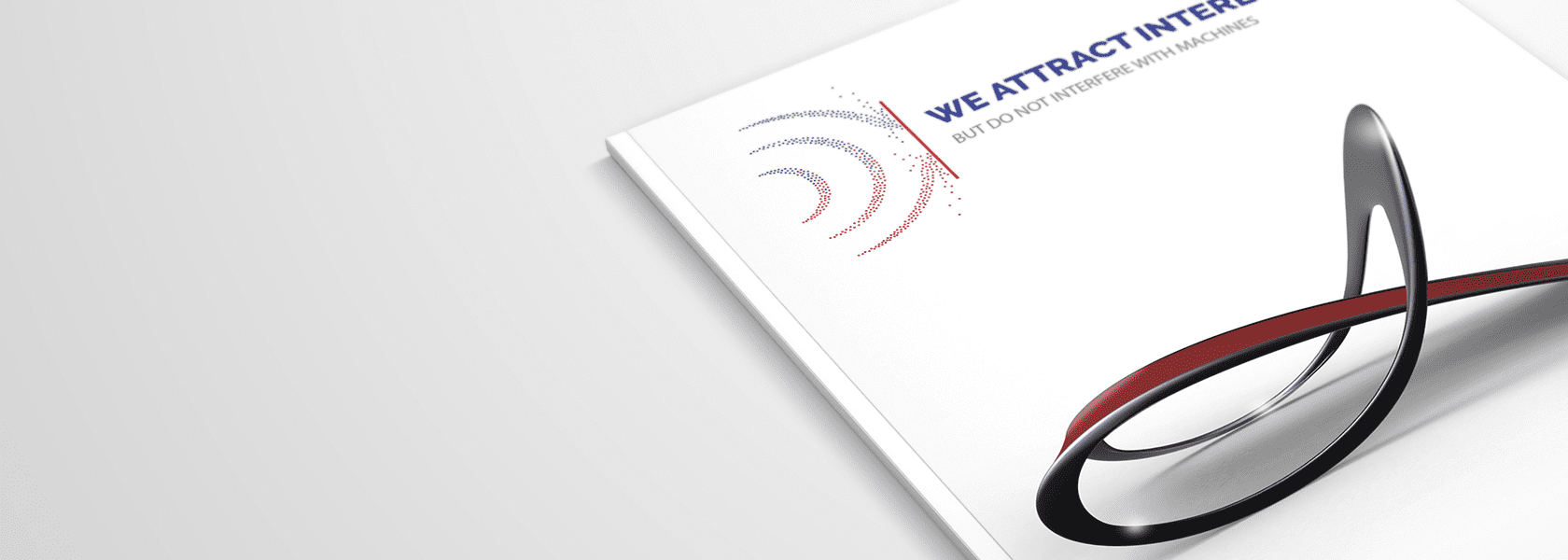
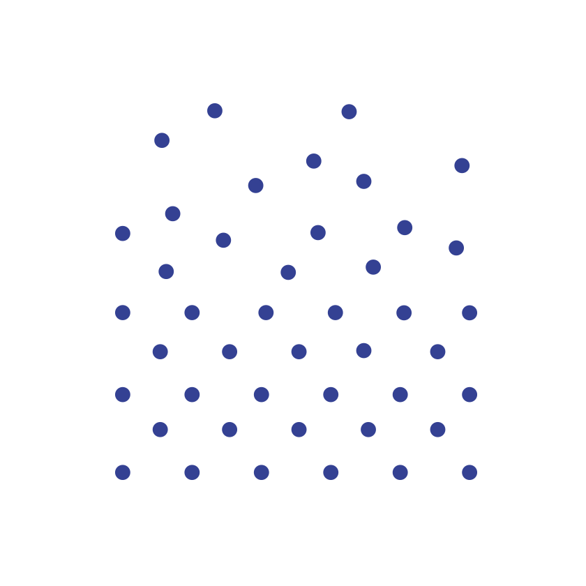
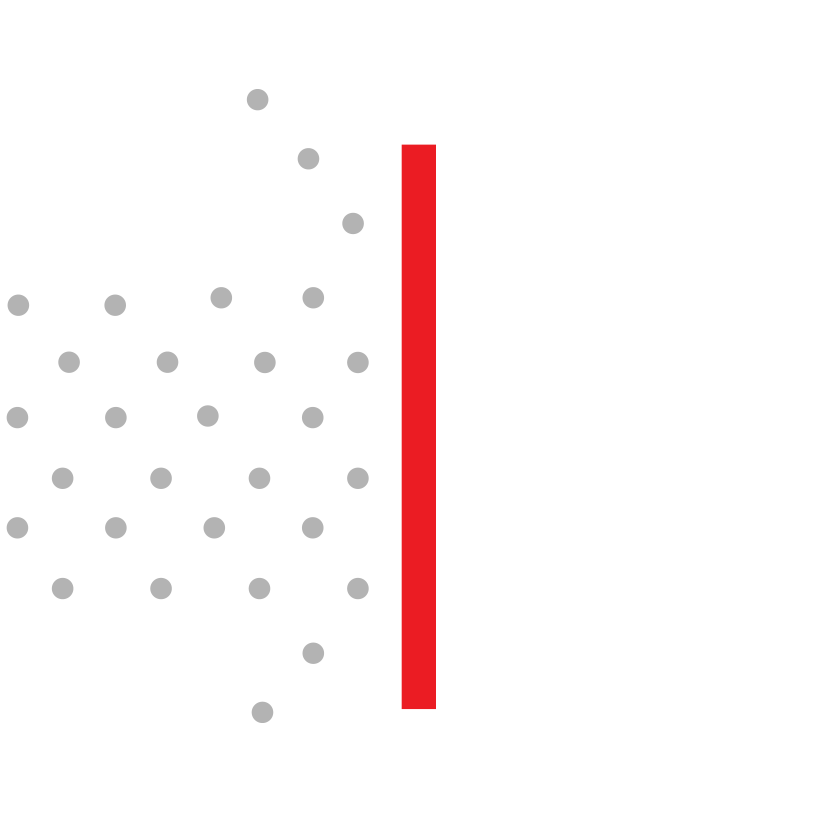
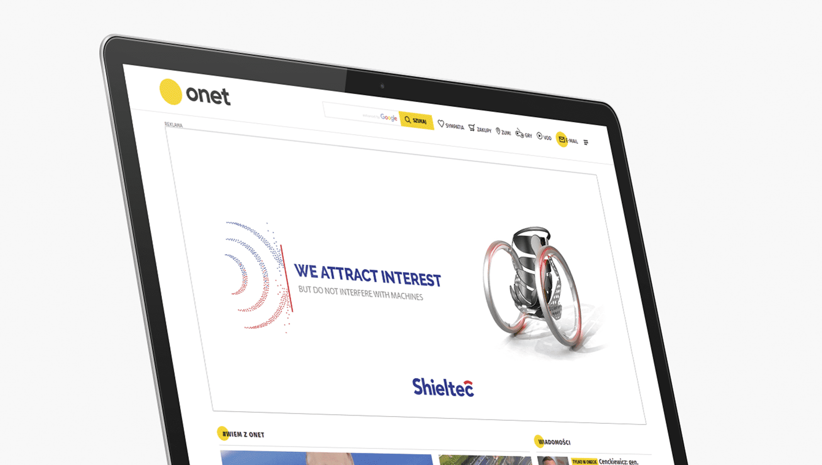
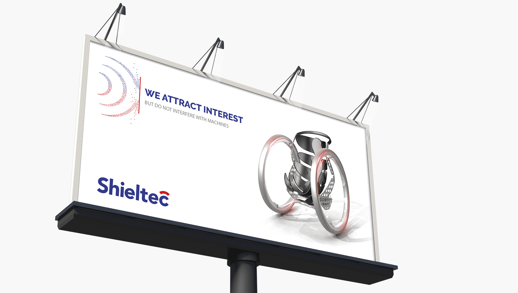
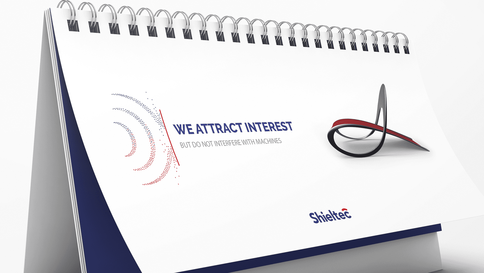
In designing the Key Visual, we decided to express the function and advantage of Shieltec’s products over the competition. We managed to accomplish this through a motif depicting particles distributed along the magnetic field lines, which break down against the shield. We combined the motif with prototype projects of non-magnetic equipment and the slogan “We attract interest, but do not interfere with machines.”
Advertising slogan
In creating the advertising slogan, we used the word game, and in particular, the ambiguity of the word attract. Shieltec’s products have no magnetic properties (attraction) and do not interfere with the operation of machines, but what the design underlines is that they attract (just like a magnet) the attention of the recipient.
Attracts – arouses interest, but also triggers a force directed towards it or that acts on another body or that mutually interacts with one another.
Interfere – negatively affects the proper operation of electrical devices, disrupts the established order or the balance of something.
Website
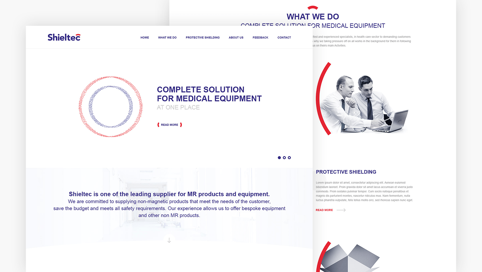
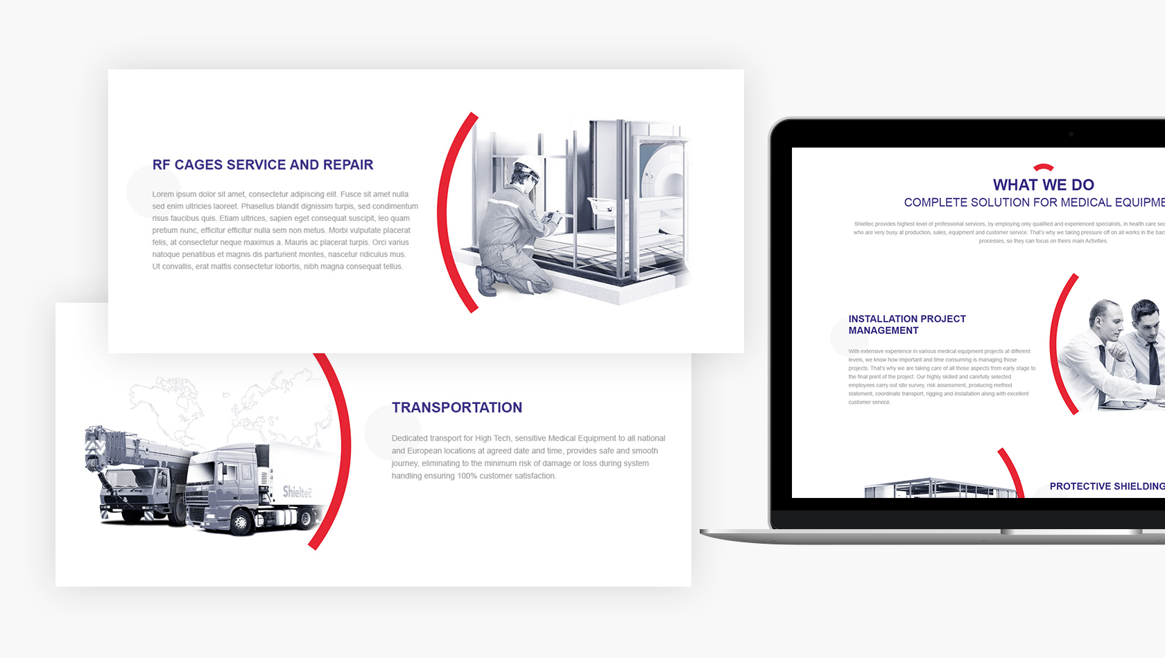
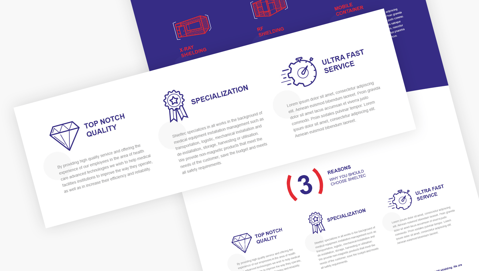
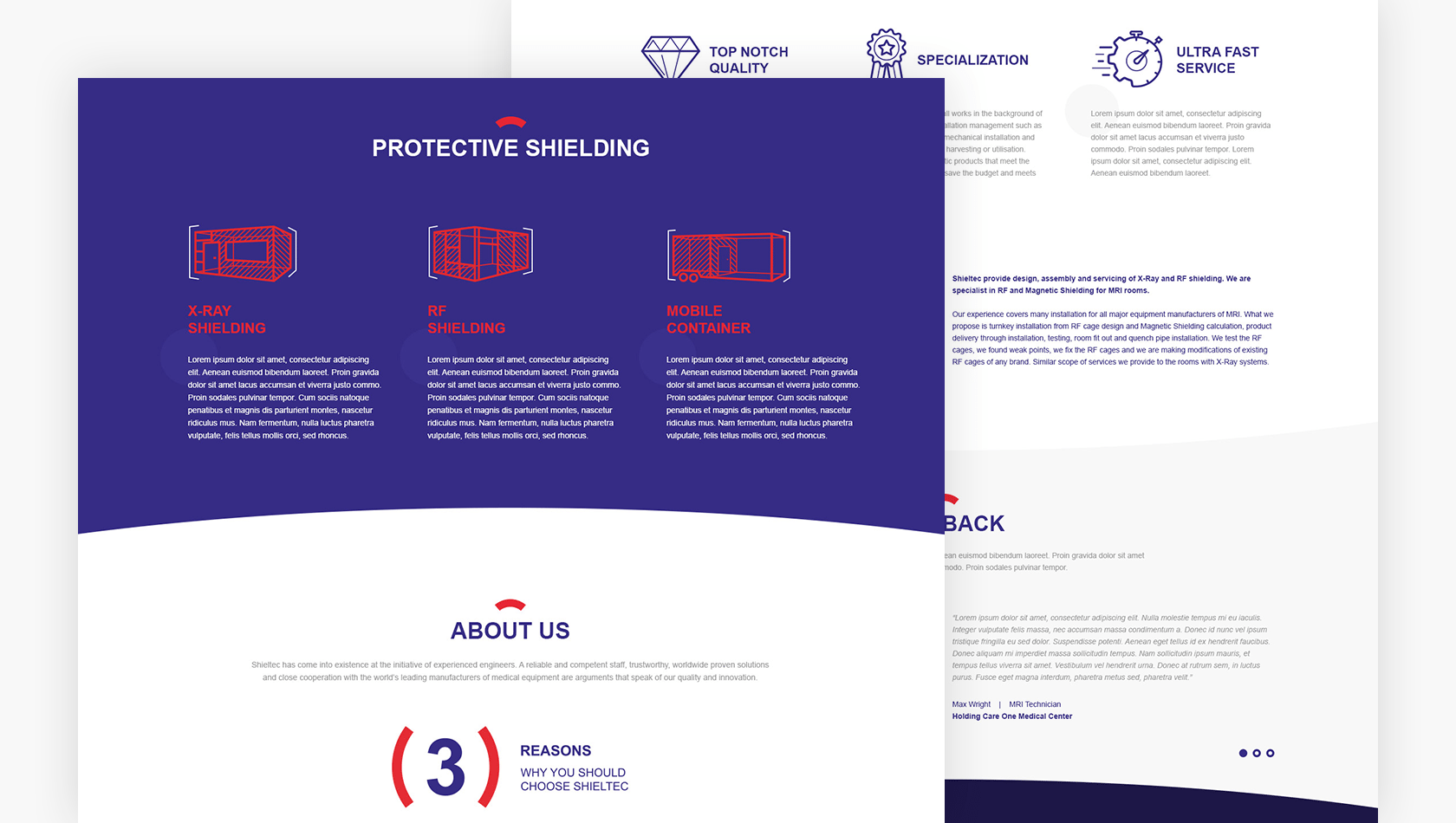
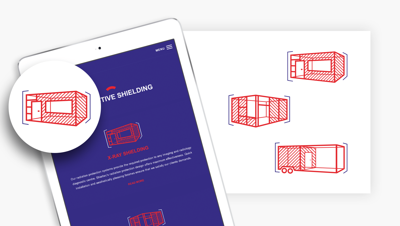
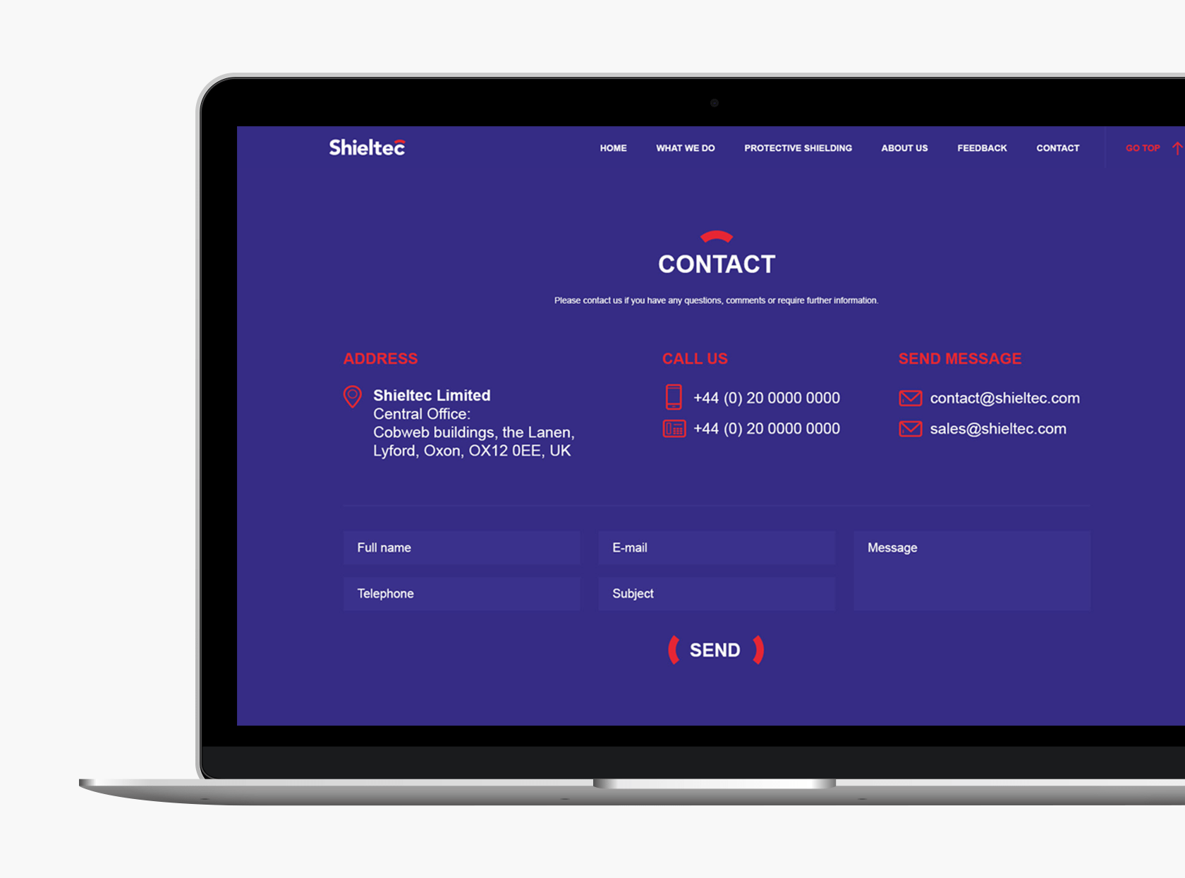
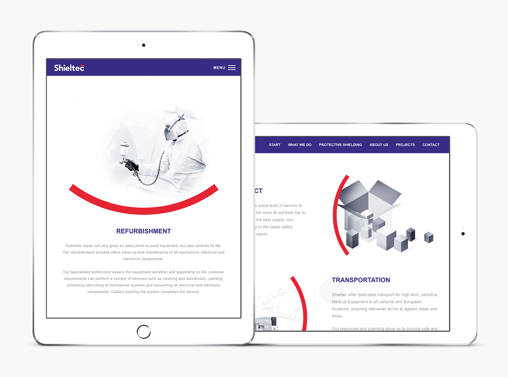
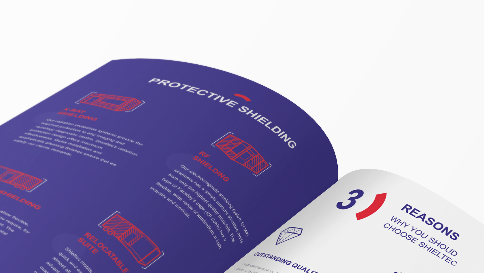
Shieltec, in its projects, attaches great importance to the quality and aesthetics of the rooms. We wanted the users of the website to see these qualities when browsing the site, which is why we reproduced them in the design of the website. To mark the sections and highlight the elements, we used the colour of the identity and red symbol of the shield.
